

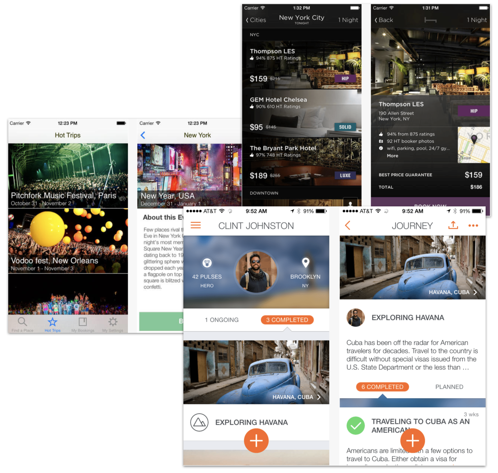
When Anthony Bordain left Travel Channel, our Layover app would become obsolete. The team wanted to expand the app to include all Travel Channel recommendations and get a larger audience.
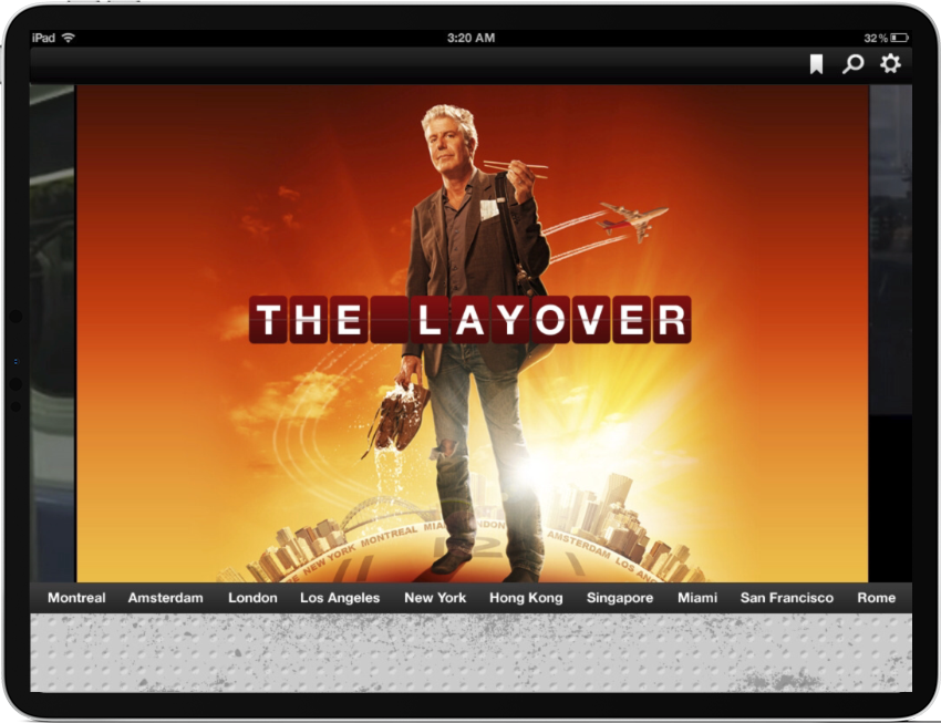
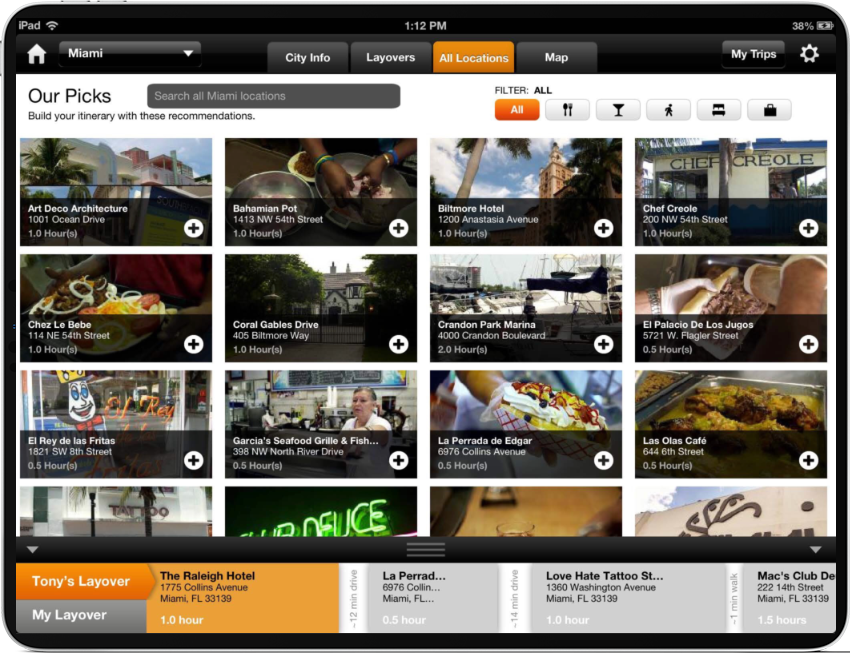
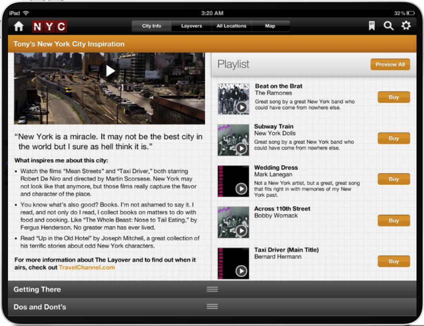
The original app, shown here, was designed with collaboration with an agency. This caused some morale issues and our internal team was primed to reinvent this app ourselves.
Travel Channel iPad and iPhone App
Problems
-
No ad revenue
There were no ad placements as the app was simply an extension of one tv show and was meant as a promotional vehicle for the show and it’s hardcore fans.
-
Limited engagement
The app cost a significant amount of money to maintain, yet we were not getting new users and retention rates were low.
-
Outdated design patterns
Design patterns and interaction models were archaic and Apple would not promote any app unless new features and patterns were used.
My role as the UX Director
-
Develop Product Strategy
Partner with my cross-functional leads to look across the suite of travel apps and determine our key differentiator. Leverage research and user data to identify critical user journeys.
Run workshops to align team members and ideate on new concepts.
-
Enable a creative and consistent design culture
Create an immersive experience that leverages relevant content and expertise from all of Travel Channel.
-
Guide Research strategy
Set the strategy for the research team and ensure we have diverse testing including qualitative user testing and proper analytics.
Advocated for and helped to implement a dynamic A/B testing framework with Optimizely.
-
Allocate resources and prioritize work
I worked with cross-functional teams and research to prioritize tasks and define an MVP.
Our Process
Research
We conducted extensive usabilty on our current app to understand usage issues and customer expectations from a Travel Channel app. However because we were broadening the audience, we also did research with those who used other travel apps to understand what they liked and what they did not like.
We came up with a few use cases to focus on:
Planning a trip
Navigating through a trip
Share feedback on points of interest
We did a through competitive analysis to understand the current landscape of travel apps and their uses.
Competitive Analysis
We ideated around core use cases with our cross functional peers. No idea was discarded. We then looked at the value proposition of each feature in regards to business needs and user needs.
Brainstorm
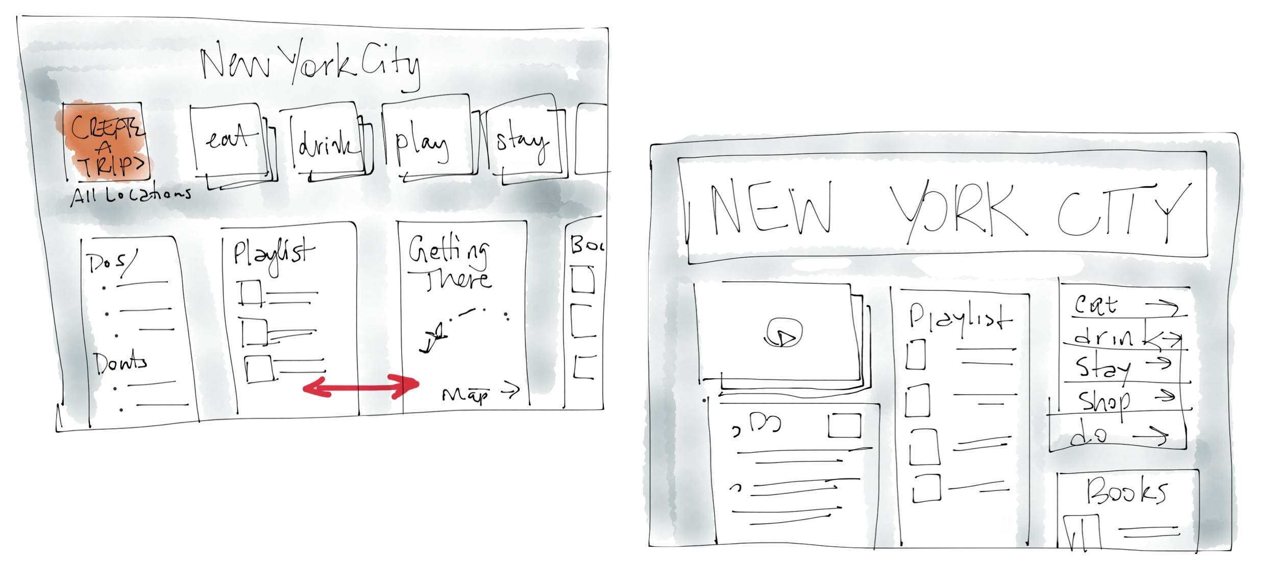
We used paper prototyping and simple point and click digital mocks to test a variety of ideas, including motion design.
We wanted to app to be immersive and seamless. Users should flow through the expereince and easily find relevant content.
We tested various concepts until we landed on something that worked.
Design Explorations/Iterations and more testing
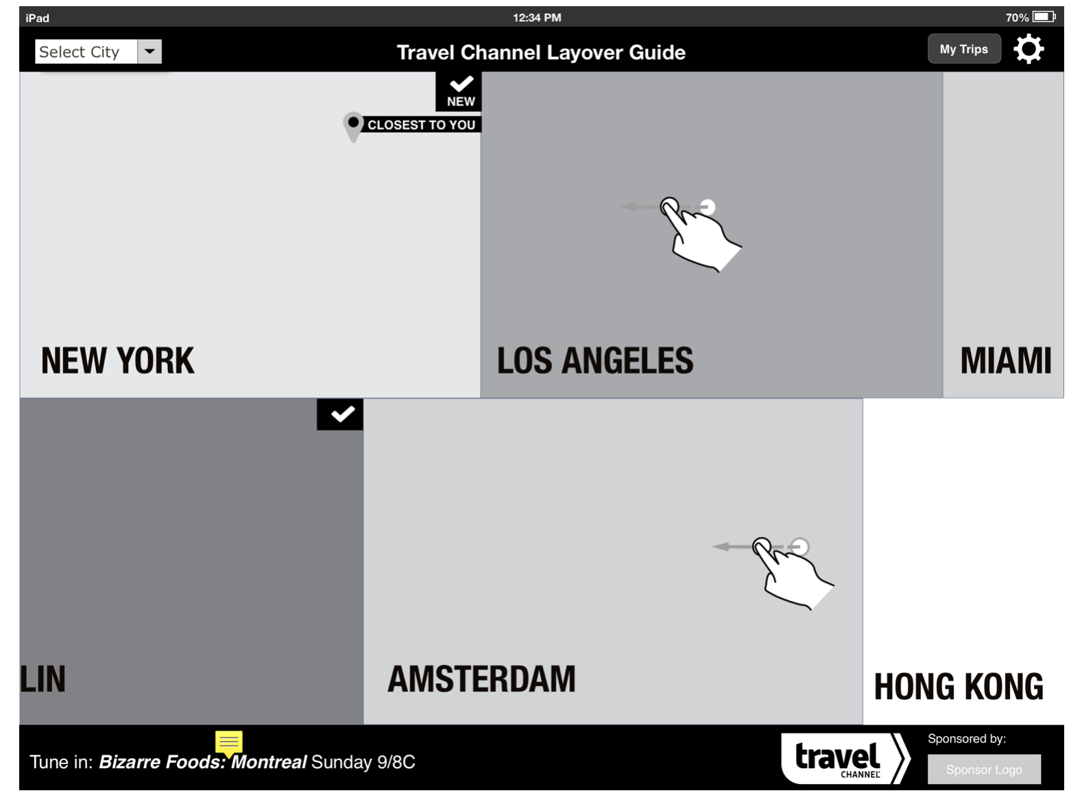
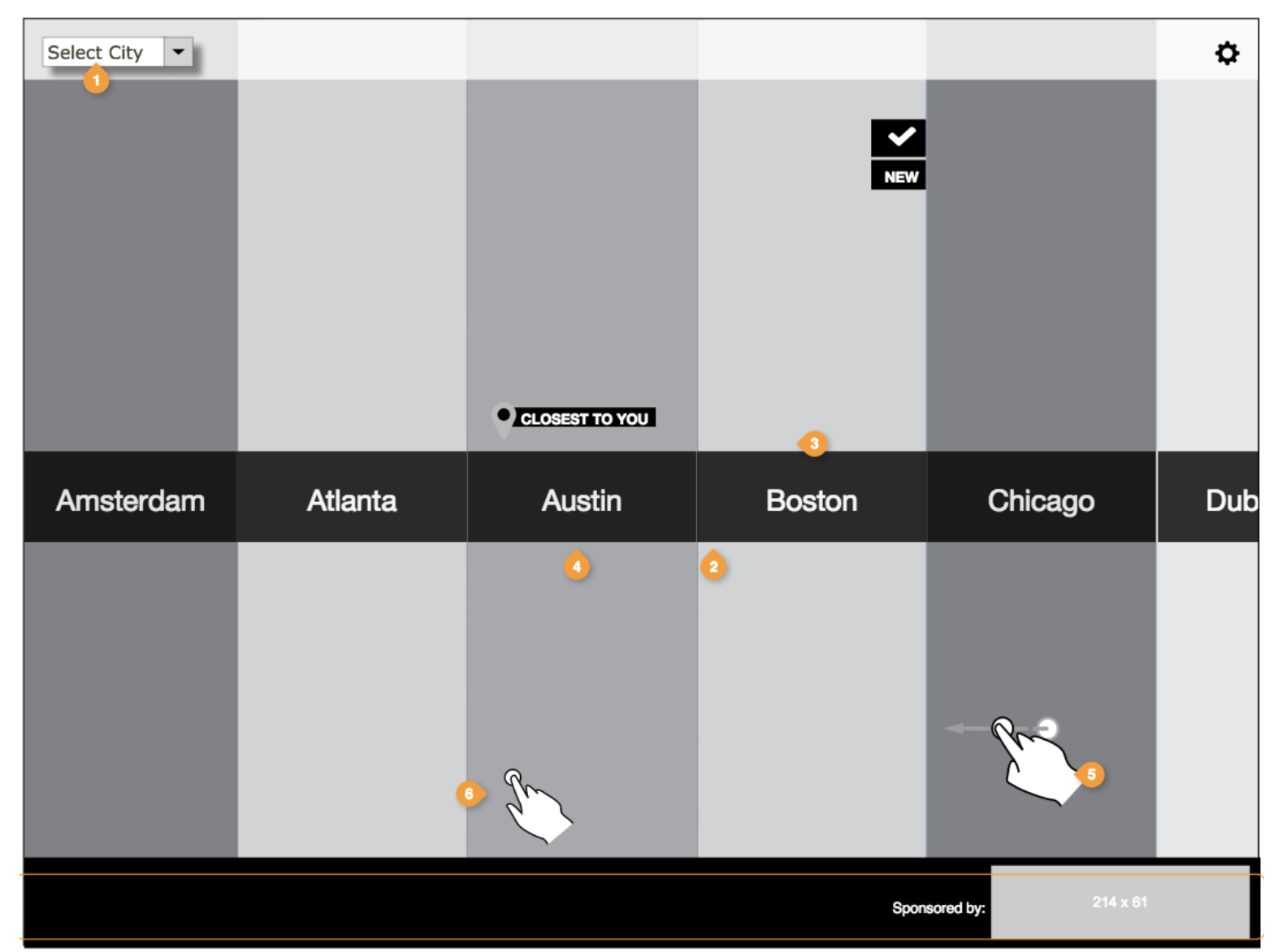
We optimized the experience to focus on the beautiful pictures we had and tried to make the interface vanish as users viruatlly explored a destination.
We build the app brand off of the newly designed Travel Channel brand.
We also leveraged motion design to create a more immersive experience.
Visual and Motion Design
We launched our new app within 6 months and under budget!
Our new app increased page views by 75% with a 24% increase in unique views. We were reaching a larger audience.
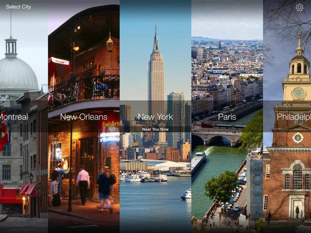
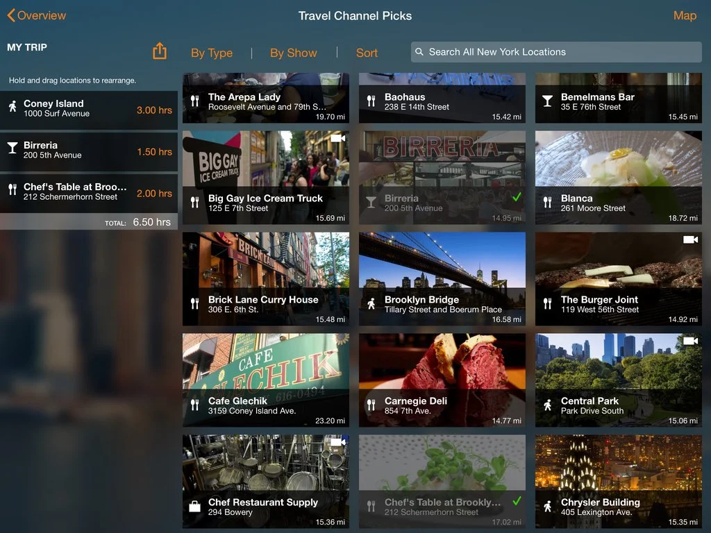
Final Experience
What I learned.
It is much easier working with an external dev team than an internal one. They were motivated to push the limit and create a slick, bug-free experience. I wanted to create the same culture for our internal team so I began speaking with the mobile ENG manager and we spoke about how we could up-level the team internally. We worked through some technical hurdles and eventually did it! The team worked on the next version of the In the Kitchen app.
Showing is believing. By prototyping the motion design we wanted and getting the stakeholders and users excited about it, we had more leverage with our external vendor to build the interactions we had laid out.