
Food Network was basically a marking site with too many goals. It was not focused on critical user journeys. Streaming video was becoming very popular, but the platform did not highlight any of it. Ad revenue was down and work needed to be done across the ecosystem of products. It’s sister site, Food.com had similar problems.
Food Network Sites
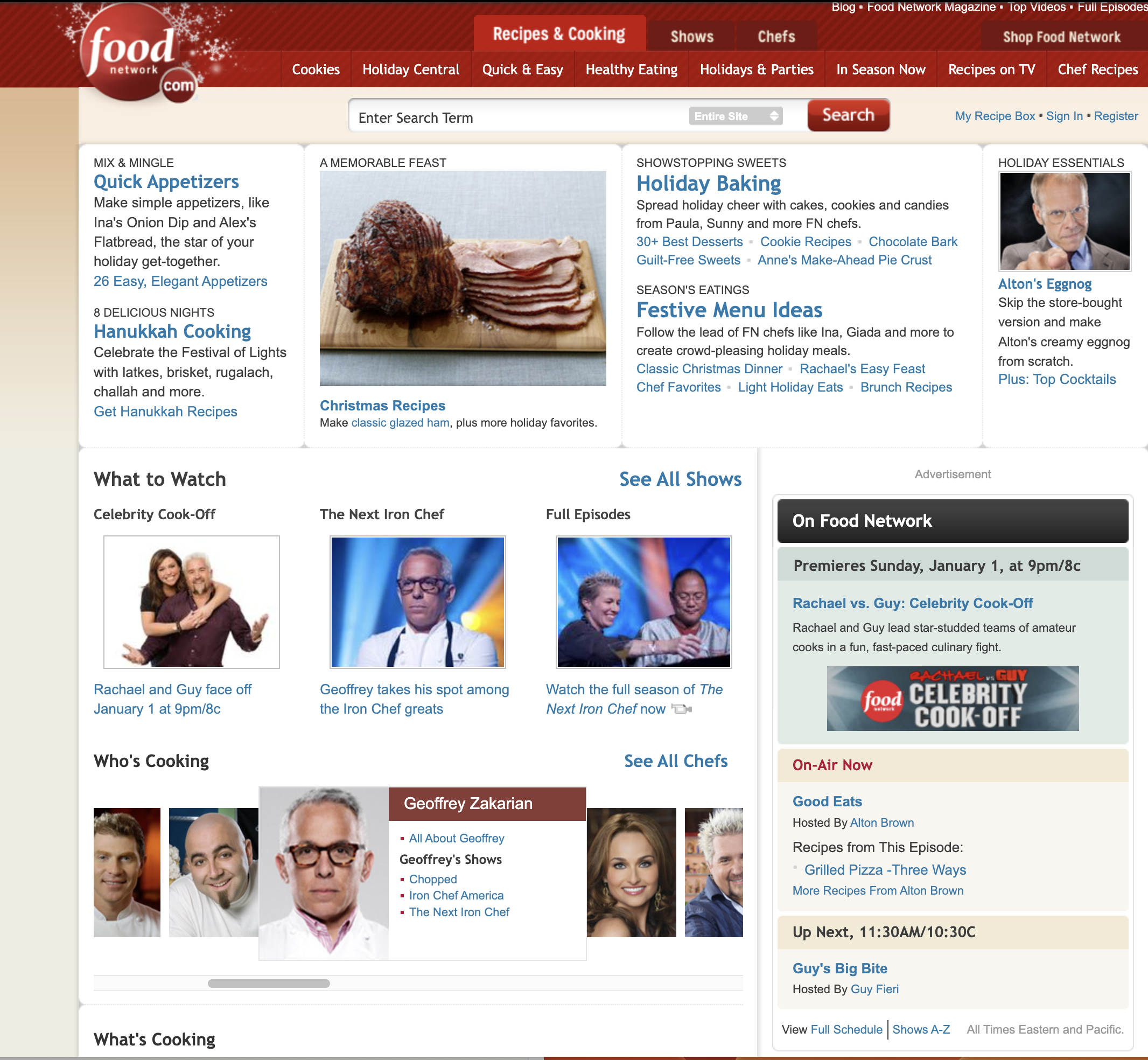
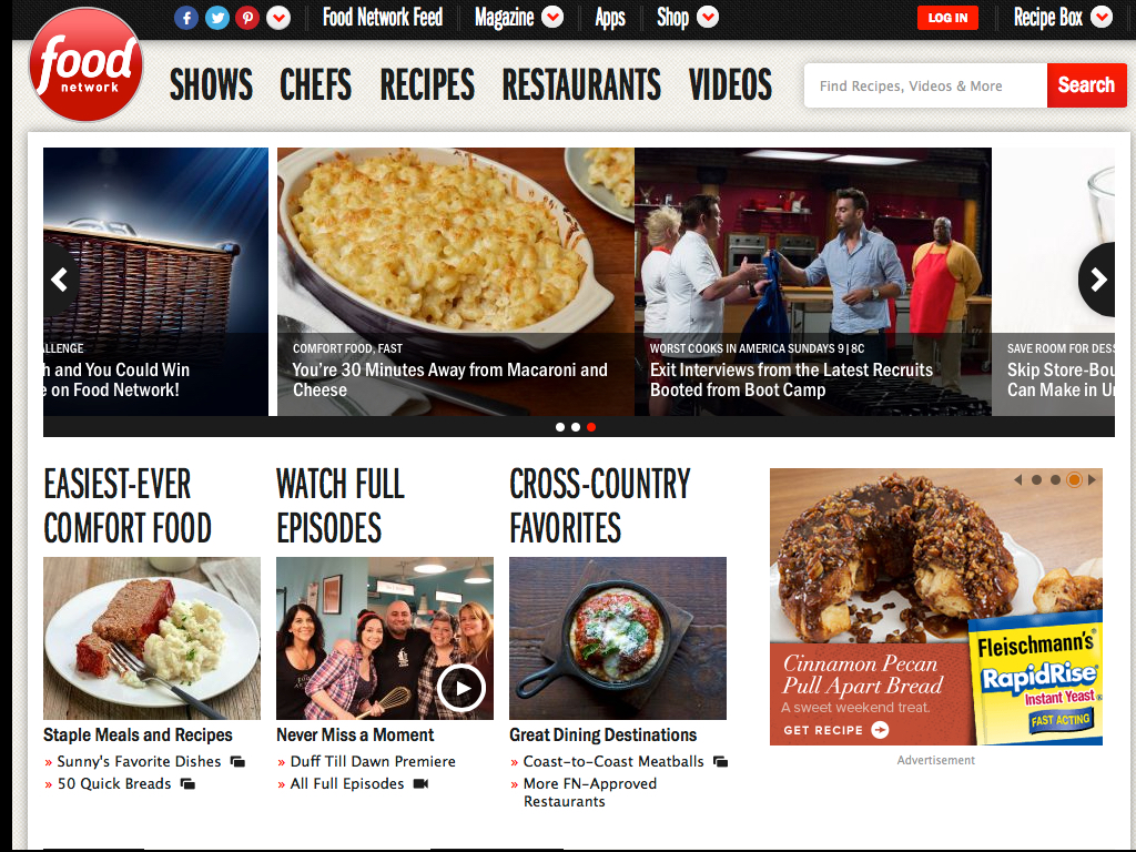
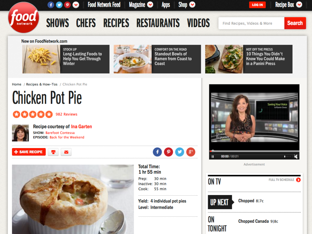
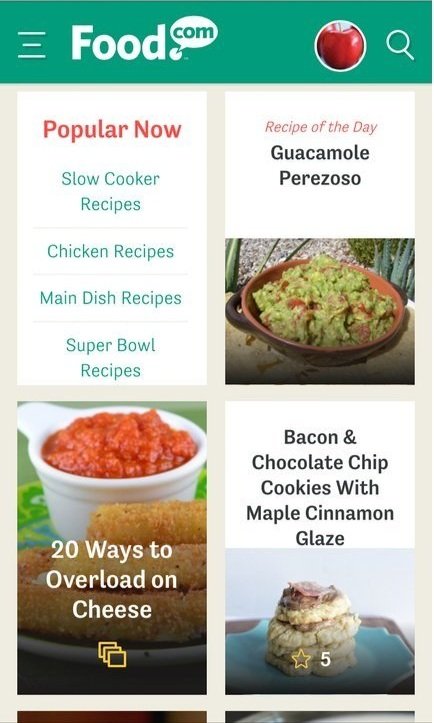
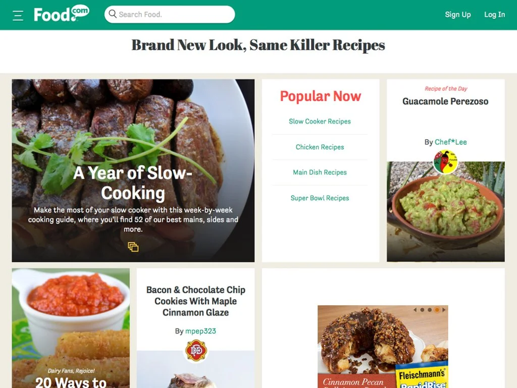
Original Sites before redesign
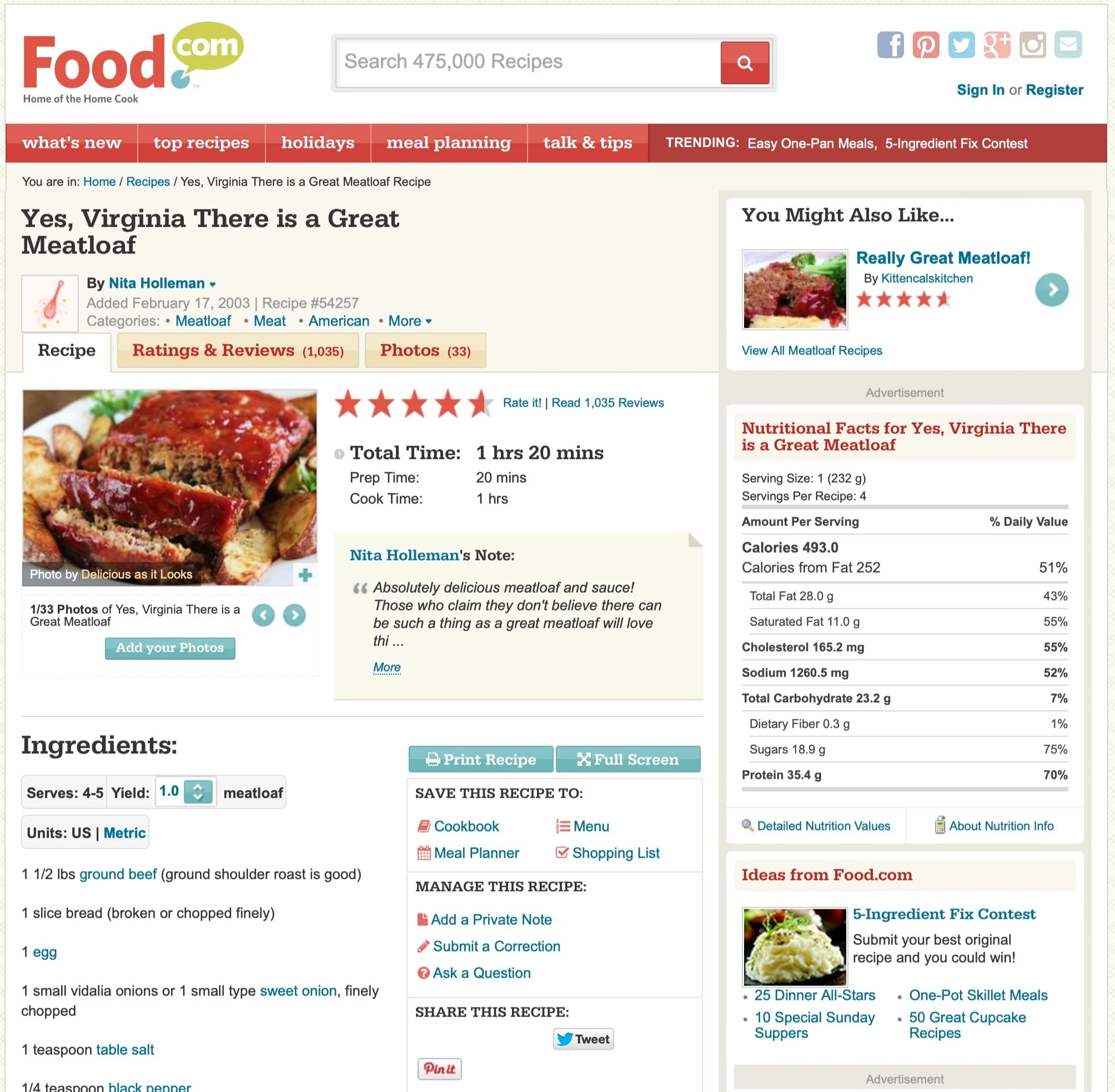
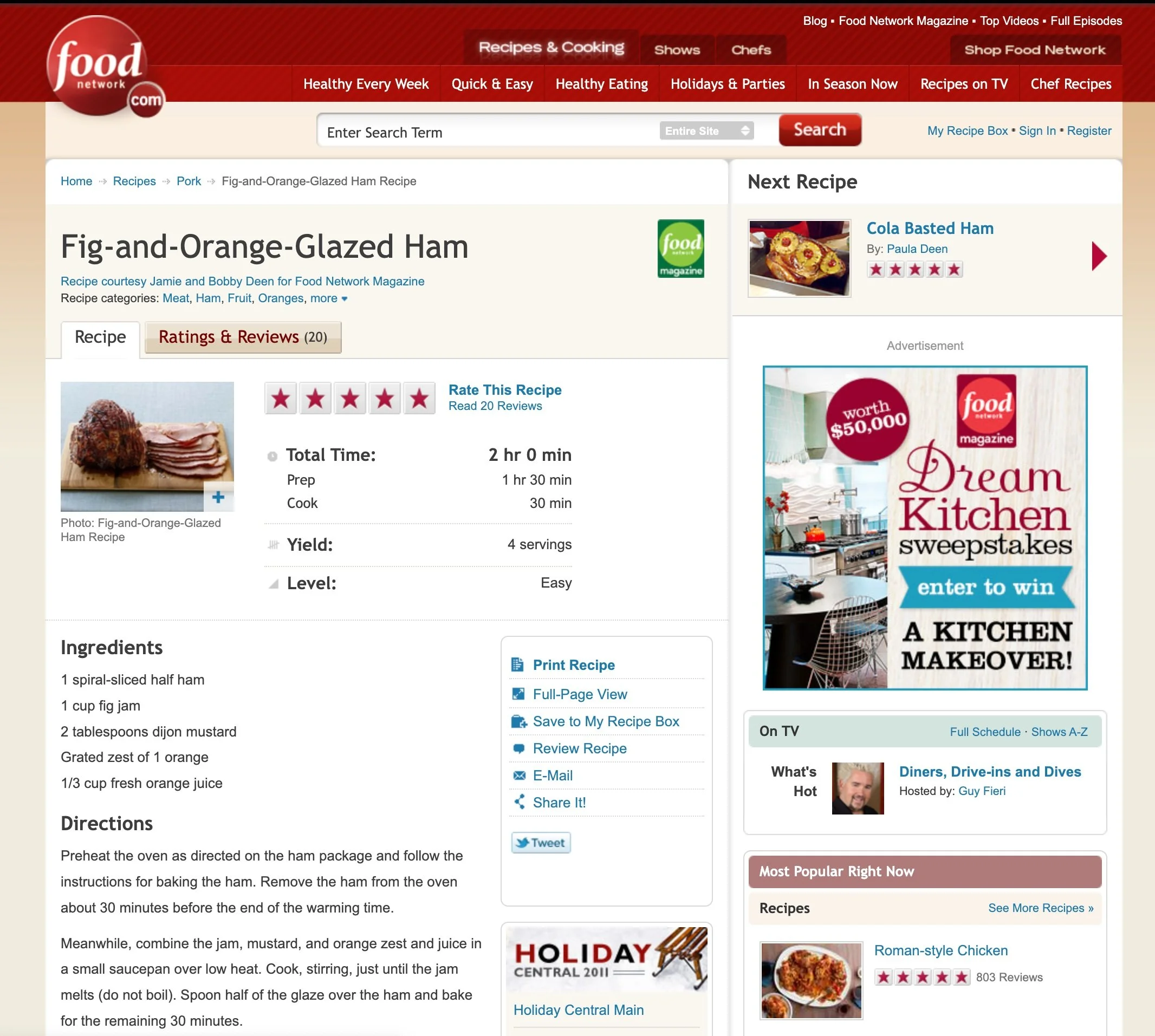
Problems
-
Poor page views
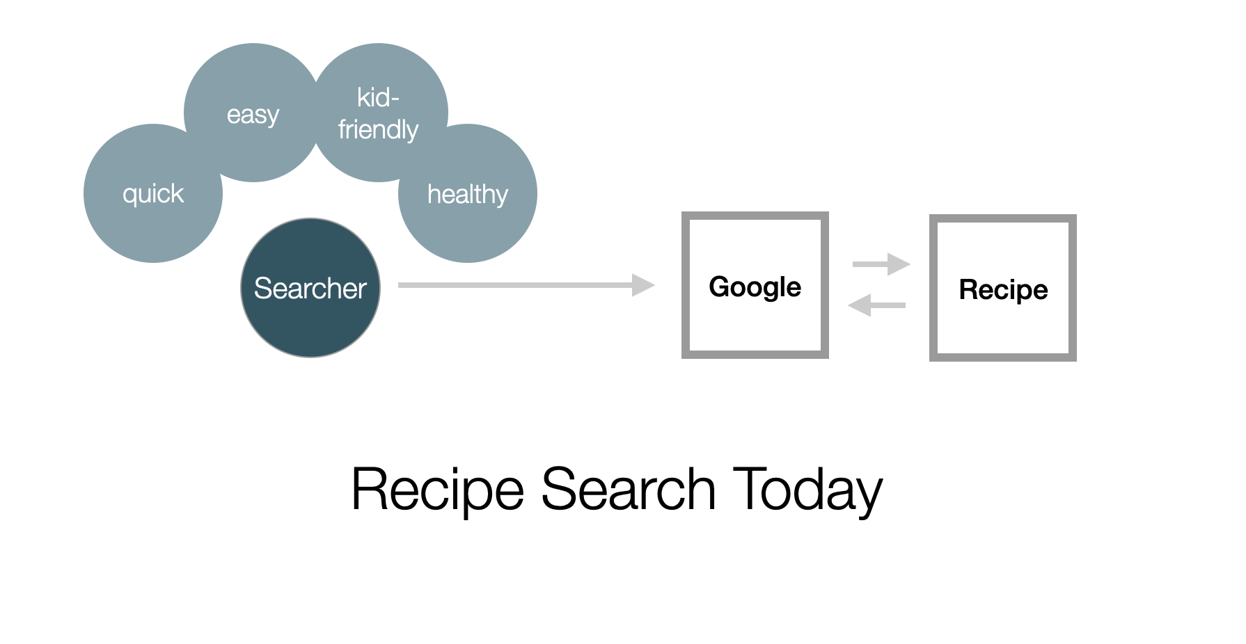
Cooks would search via Google and goto a recipe and then leave the site. The rest of the site had minimal engagement.
-
Ad revenue down
Googlers were more distributed than ever and felt disconnected to their teams, especially during the pandemic.
-
Editorial woes
Editors had many manual tasks to create stories around recipes. There were no consistent modules or interactions they could use.
My role as the UX Director
-
Develop Product Strategy
Partner with my cross-functional leads to look across the suite of Food Network sites and determine a holistic strategy that would optimize the content for the specific experience and primary use case.
Run workshops to align team members and ideate on new concepts.
-
Enable a creative and consistent design culture
Create common modules that can be leveraged across Food Network to optimize usability and increase revenue.
Setup and run design reviews with peers.
-
Guide Research strategy
Set the strategy for the research team and ensure we have diverse testing including qualitative user testing and proper analytics.
Advocated for and helped to implement a dynamic A/B testing framework with Optimizely.
-
Allocate resources and prioritize work
I worked with cross-functional teams and research to prioritize tasks and define an MVP.
Our Process
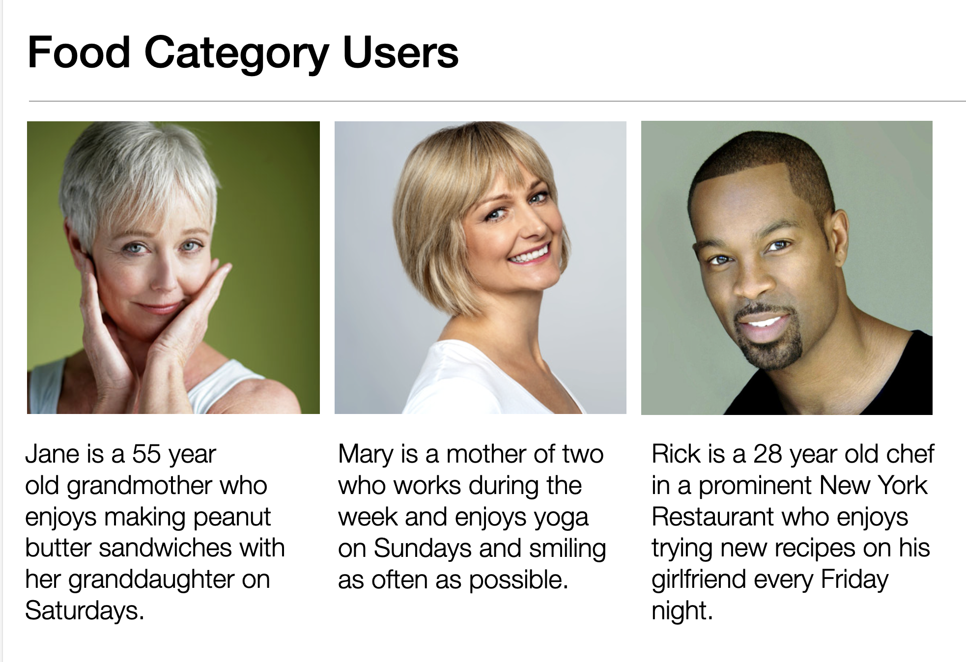
We leveraged internal research, external research and any site analytics we had to better understand our critical user journeys. We broke out our core user types.
We also partnered with our editorial team to understand their pain points of the current publishing process and how they ideally wanted to tell the story.
Researched our customers
Define design principles
I led the effort to clearly articulate our design principles. I leveraged real world examples and had interactive workshops to align team members on these
Create simple designs for real users and real tasks
Be contextual
Be consistent
Use simple and natural language
Let the content drive the design
Provide adequate feedback
Reduce errors
Delight the user in surprising ways
Test, Measure and Retest
Easily find the right recipe (including one from a recent show)
Easily watch last night’s episode of X
Based on our research and business needs, we decided to focus on two user journeys. I aligned stakeholders on this decision and evangelized focusing on these and putting other ideas into a “parking lot”.
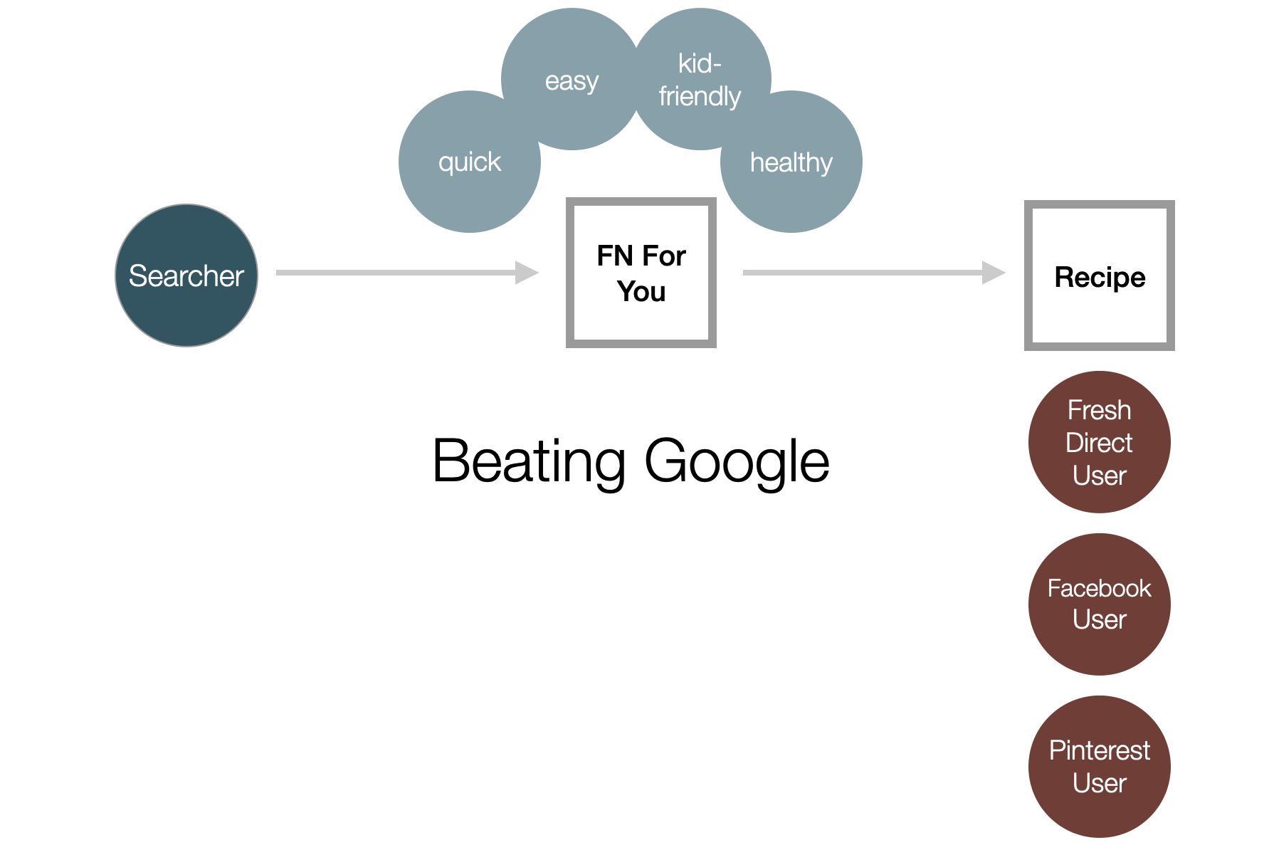
Prioritize the Journeys
We were competing against Google search. We wanted users to stay on Food Network and browse there. Eventually, we wanted users to start their recipe search on Food Network instead of google. I got buy-in on these ideas from senior leadership.
Changing existing navigation
We wanted a focused experience to help users whenever they needed it, wherever they needed it. Mobile usage was dramatically increasing. So, when possible, we built responsive sites. We also accounted for various ad sizes to optimize our revenue. I iterated on these concepts and shared them with cross-functional peers to get alignment.
Rethinking our sites architecture
We did a number of tests and ended up testing a few concepts in an A/B environment.
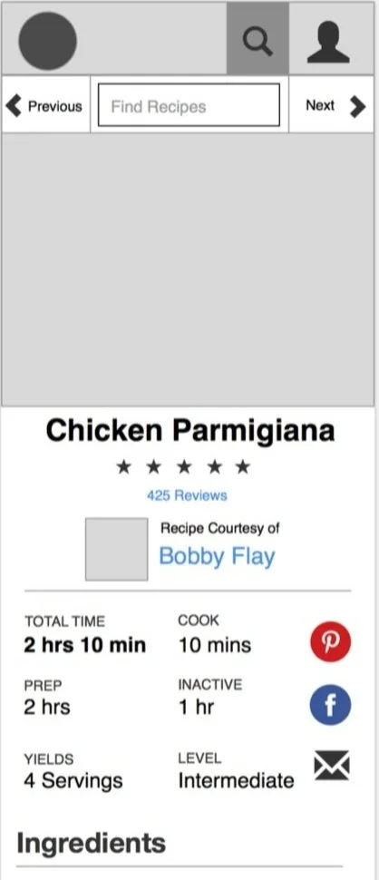
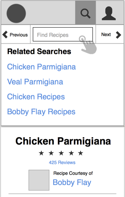
Surprising, navigation to prev and next recipes did not resonate with users so we needed a new approach.
A recipe stream of never ending recipes worked the best.
I created a number of the mocks we tested as we wanted to get a range of ideas on the table.
Sketching, mocking and testing
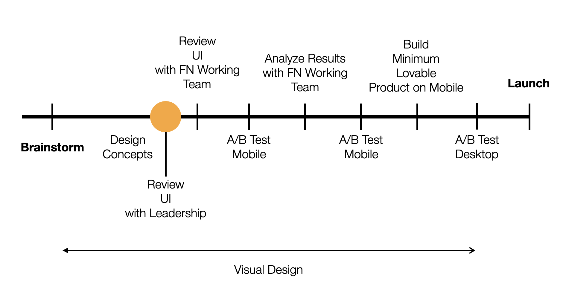
We aligned around a moodboard and then added some color to the most successful mocks.
Overall we increased unique visitors to the site by 14% and increased video views by 72%. (Video ads were the most expensive and led to a dramatic increase in revenue) The entire food category of work represented over a billion page views per quarter.
Final Designs
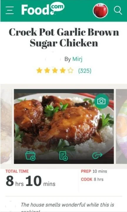
The new Food.com responsive sites doubled page views and increased unique visits by 50%.
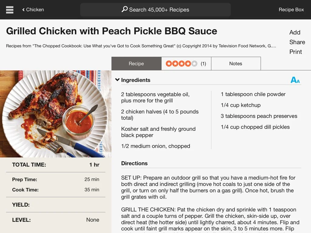
We created a new In The Kitchen iPad and iPhone app that were hugely successful.
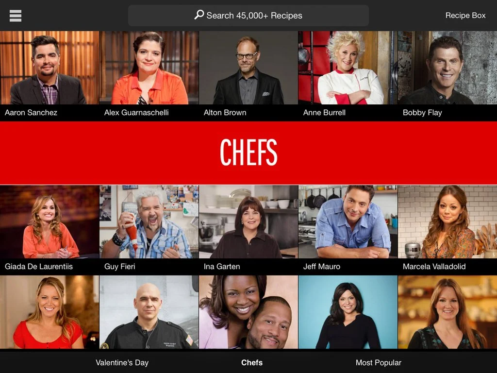
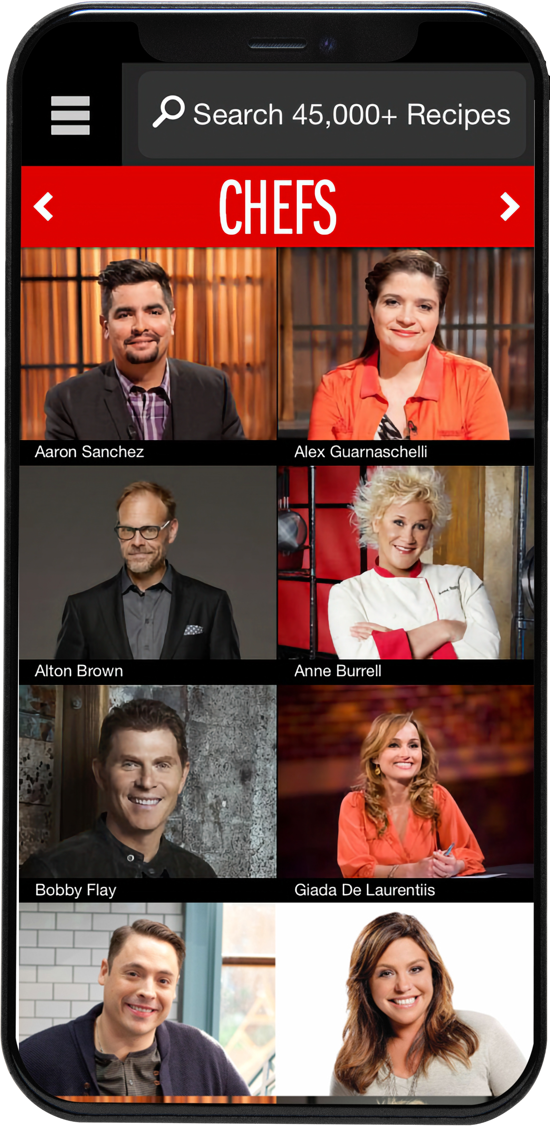
We highlighted the number of recipes in our app to ensure users understood the breath of content.
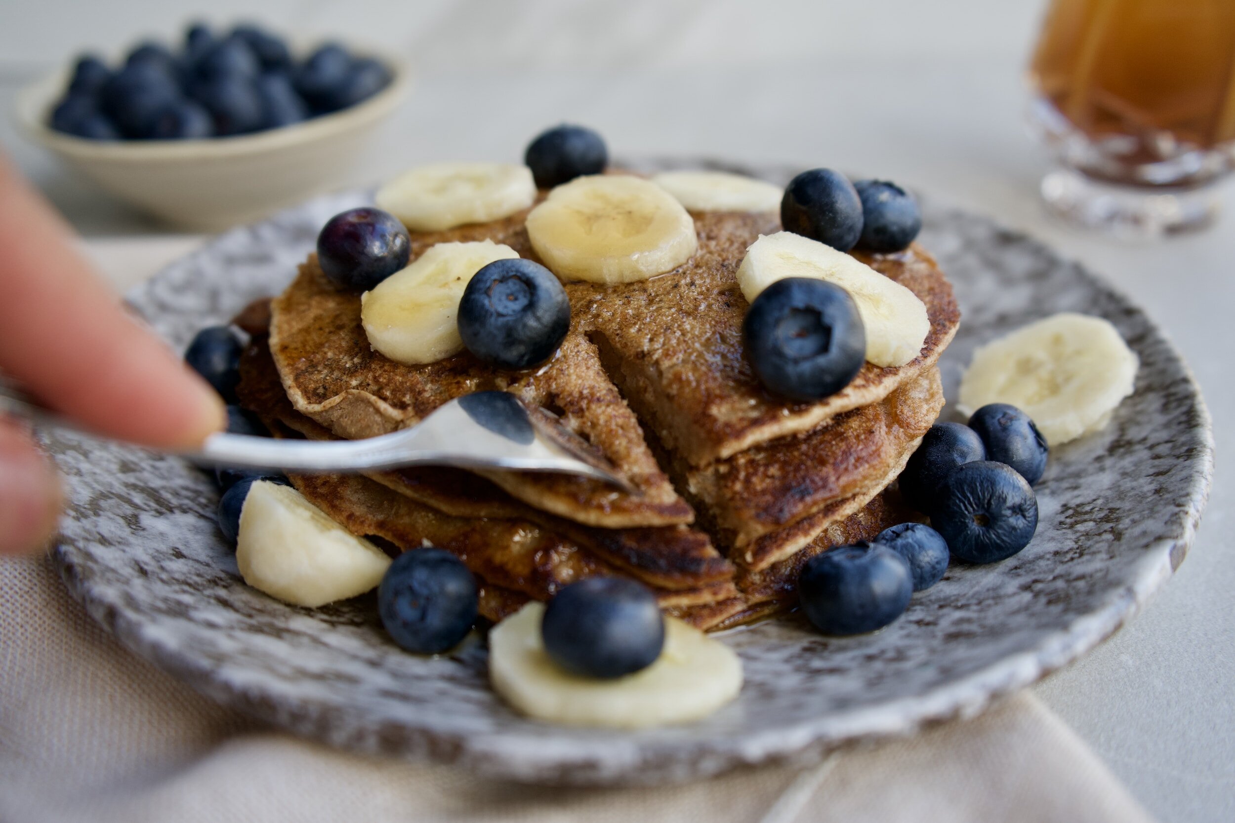
We also focused the experience around Food Network’s key differentiator, it’s chefs!
Unique views increased by 211%, Video views doubled, page views went up by 2500%
Creating new products
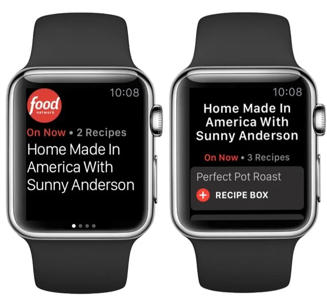
I led the design of a new experimental gesture based recipe page with Intel’s Real Sense technology.
What I learned.
A/B testing is great, but it has to effectively be joined with qualitative testing. For certain products, ENG would constantly A/B test every feature without thinking about the entire experience. In future projects, I would bring ENG into the process earlier during the research planning phase to educate them on the nuances of each research method and how we can put them together to form a coherent understanding of a user’s journey through our product.
Some of our ideas during brainstorming sessions got ahead of what our ENG team could build. Although we had partial ENG involvement in our workshops, in the future, I would work harder to understand technical constraints and call them out explicitly in the ideation stage.